-Leon “2K” Asare
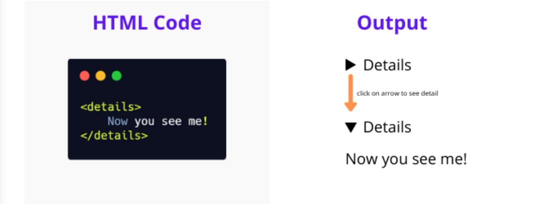
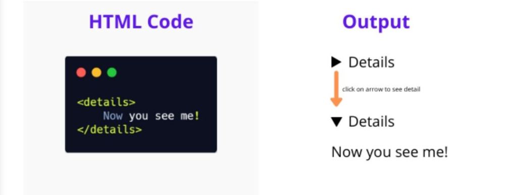
The HTML <details> tag is a fantastic, native way to create expandable and collapsible content widgets on your webpage, often called an accordion or disclosure widget. It’s semantic, accessible, and requires no JavaScript for its basic functionality. Let’s explore how to use it!
The Basic Structure: At its core, the <details> tag works in conjunction with the <summary> tag. The <summary> defines the visible heading that a user clicks to reveal the hidden content. Any content placed outside of the <summary> but inside the <details> tag will be hidden by default.
Here’s the most basic example:
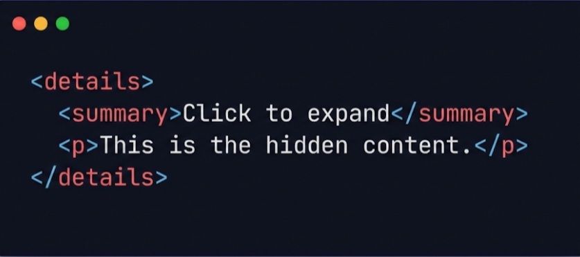
In this example, the user sees “Click to expand”. When they click it, the paragraph “This is the hidden content.” is revealed.
Styling with CSS:
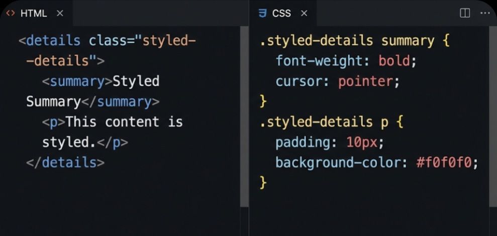
The <details> element can be styled just like any other HTML element. You can change the appearance of the summary, the hidden content, and even the disclosure triangle.
The following image shows an example of how to apply some basic CSS to make the widget look a bit nicer. We’ve added a class for targeting, made the summary bold with a pointer cursor, and added some padding and a background color to the hidden content.
The open Attribute:
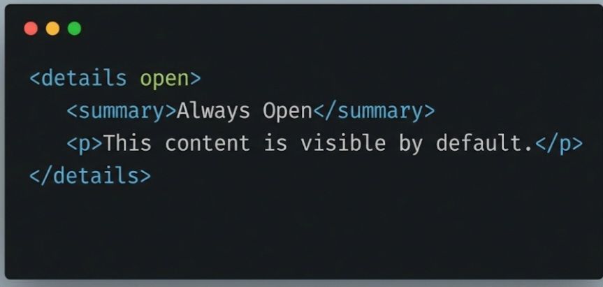
By default, the content of a <details> element is hidden. If you want the content to be visible when the page loads, you can add the open boolean attribute to the <details> tag. The user can still click the summary to collapse it.
The <details> and <summary> tags are a powerful duo for creating interactive and clean user interfaces. Give them a try in your next project!
-Leon “2K” Asare The Progressive Coder
 Leon The Progressive </✊🏿> Coder